Digital Washing Machine
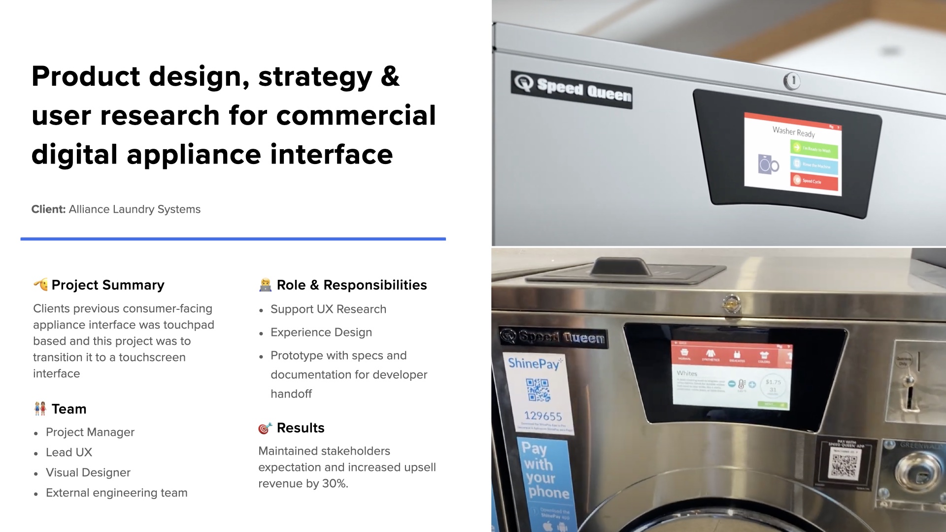
Product design, strategy & user research for a commercial digital appliance interface transitioning from touchpad to touchscreen.
Product design, strategy & user research for a commercial digital appliance interface transitioning from touchpad to touchscreen.
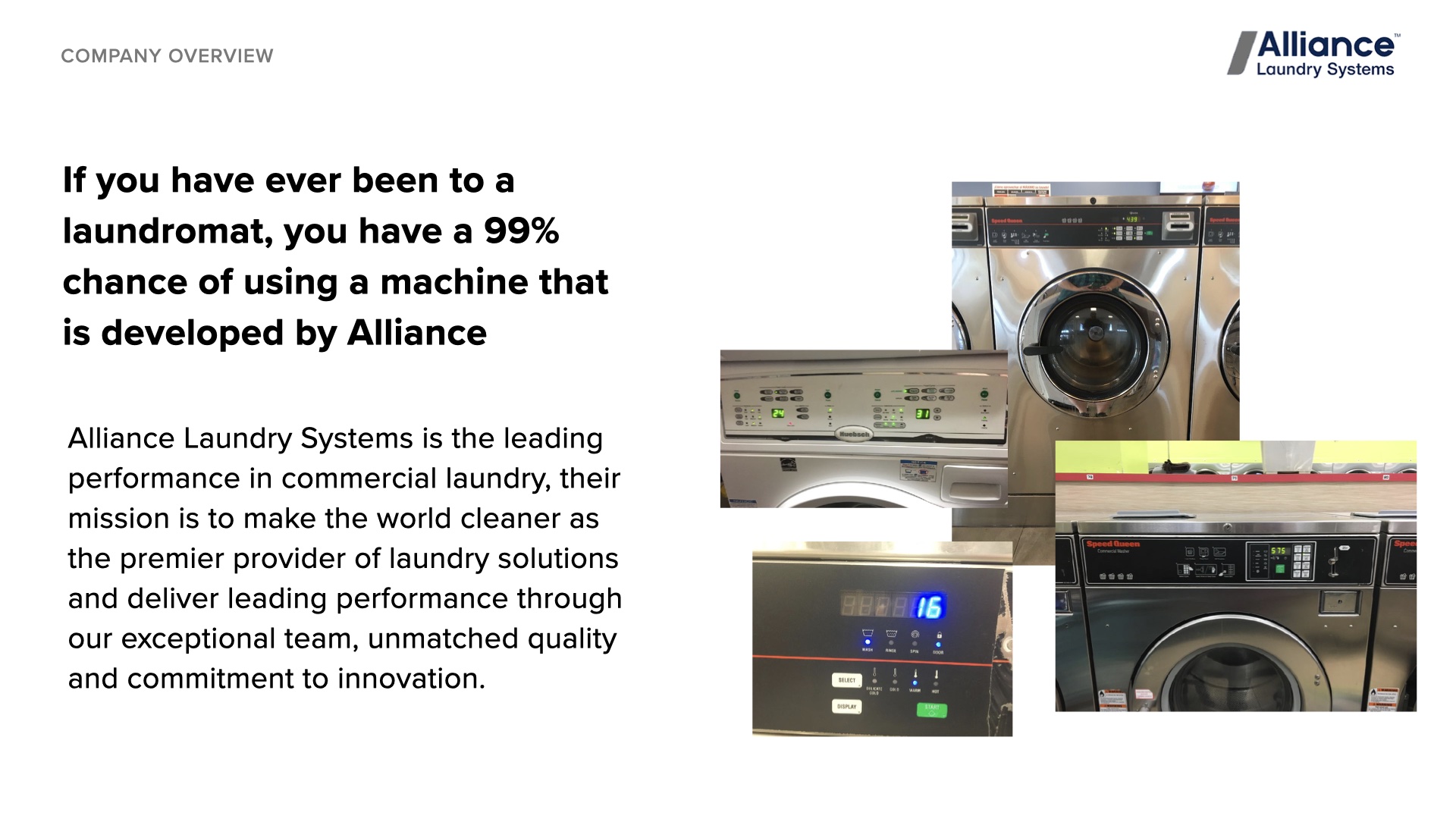
Alliance Laundry Systems is the leading provider in commercial laundry. If you have ever been to a laundromat, you have a 99% chance of using a machine developed by Alliance.
Their mission is to make the world cleaner as the premier provider of laundry solutions and deliver leading performance through their exceptional team, unmatched quality, and commitment to innovation.
The client's previous consumer-facing appliance interface was touchpad-based. This project was to transition it to a touchscreen interface while maintaining stakeholder expectations and enhancing the user experience.
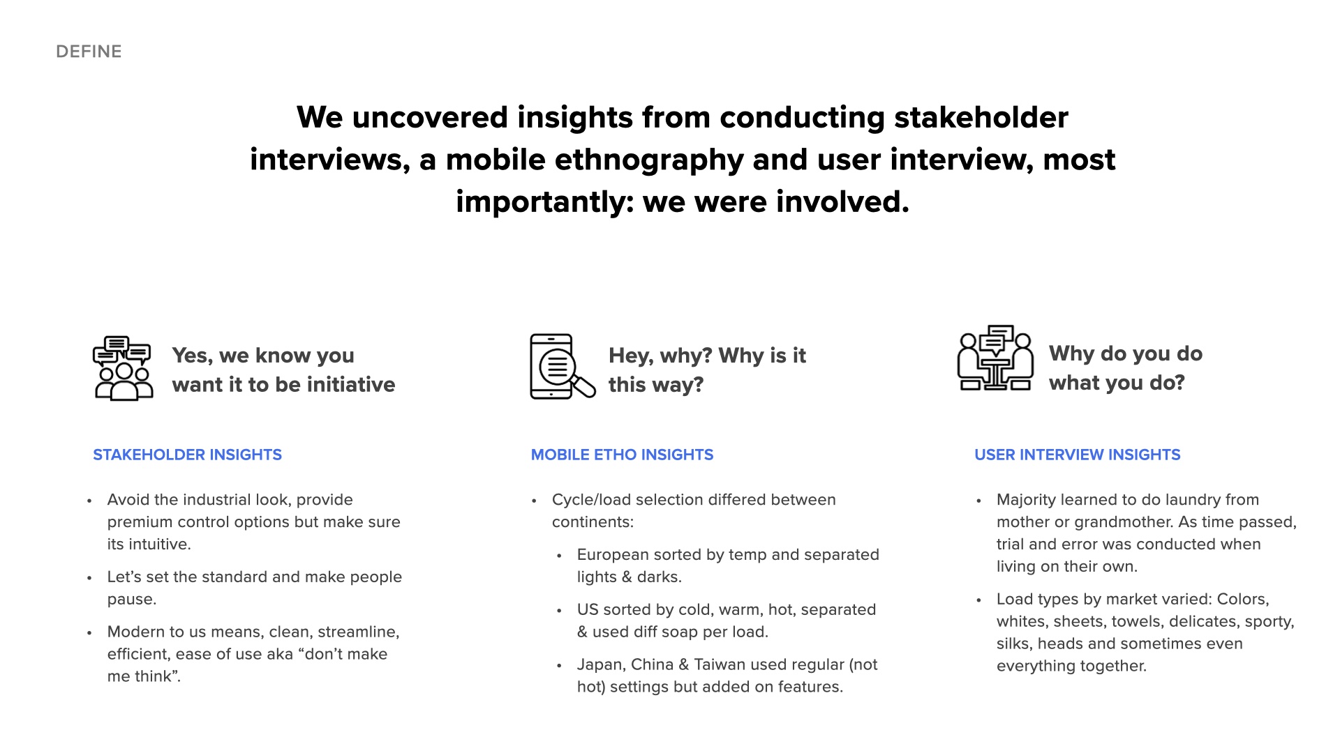
"Avoid the industrial look, provide premium control options but make sure it's intuitive. Let's set the standard and make people pause. Modern to us means clean, streamlined, efficient, ease of use - aka 'don't make me think'."
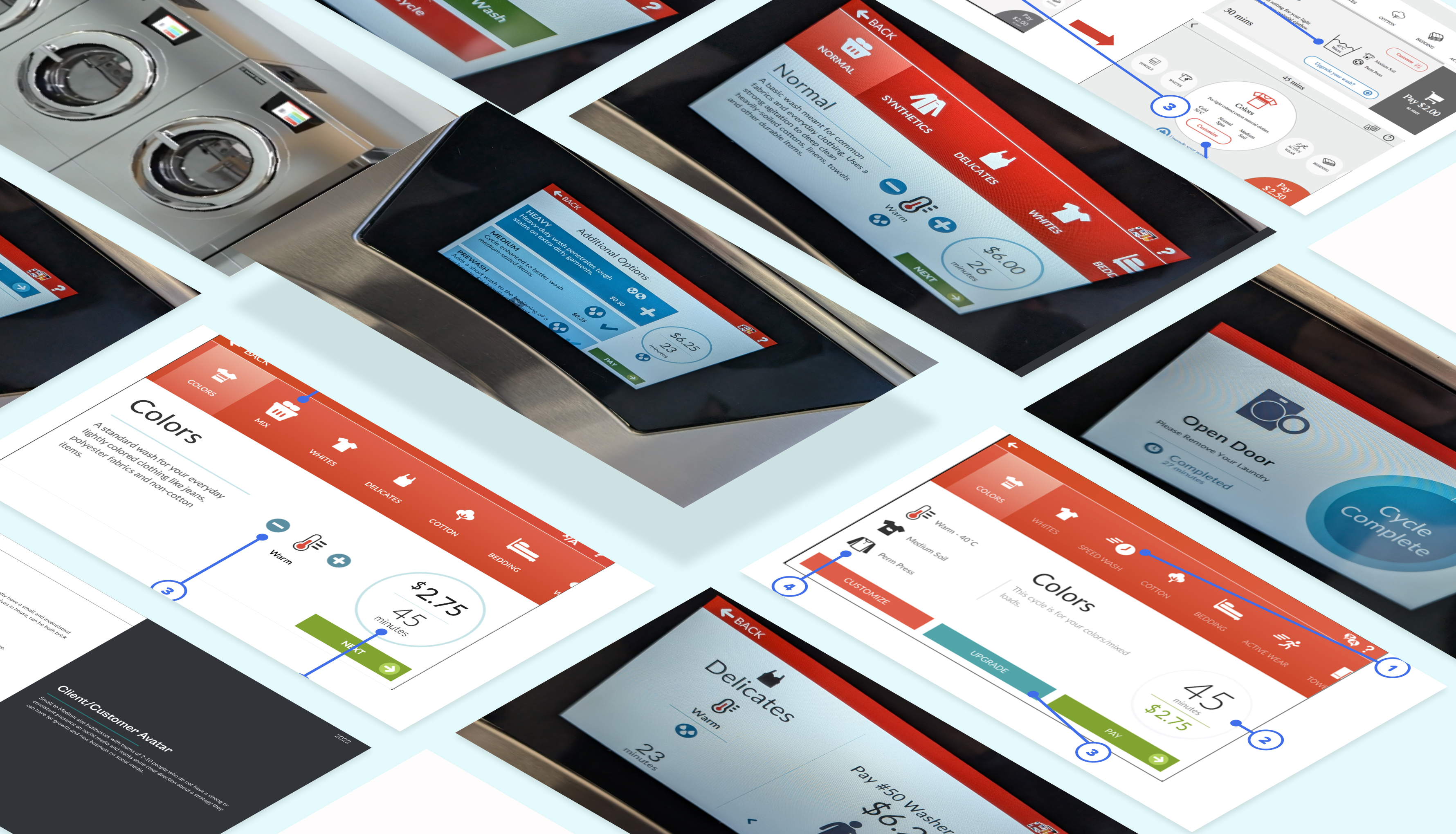
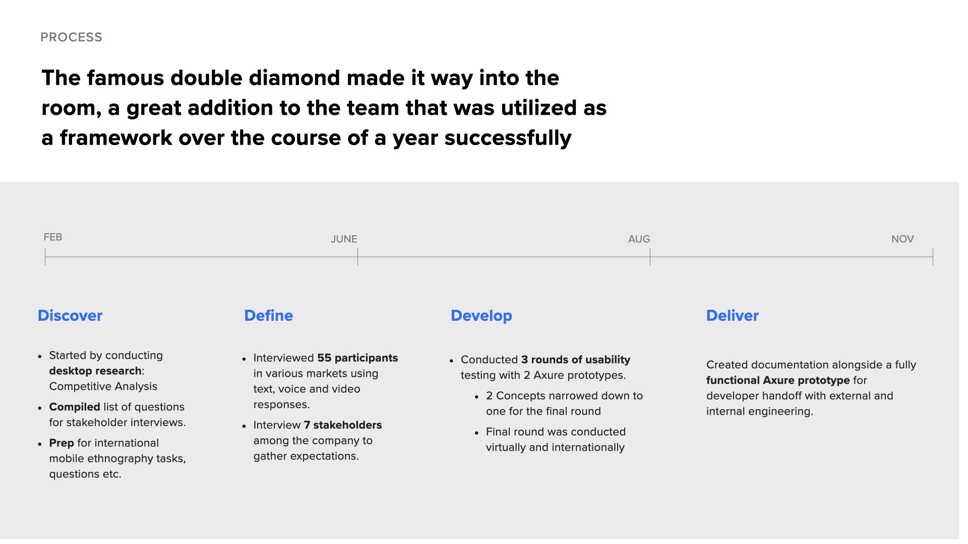
The famous double diamond framework was utilized over the course of a year successfully.
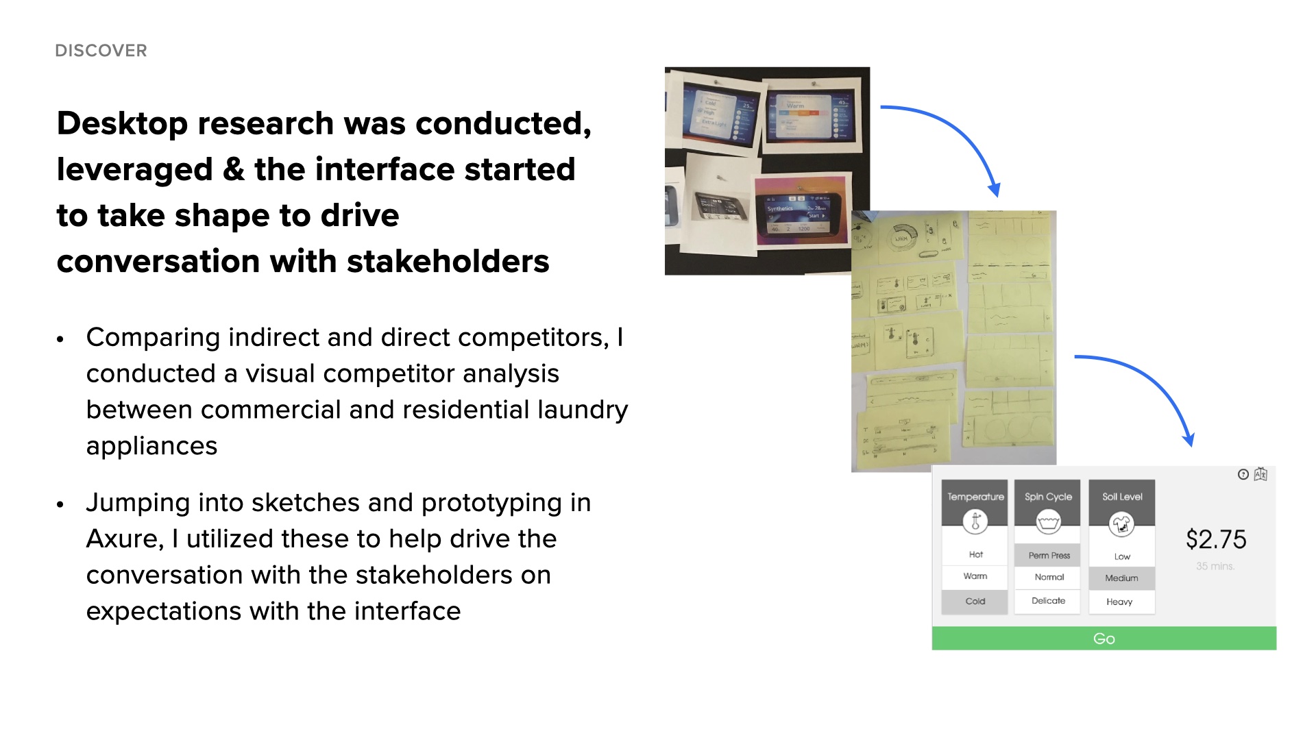
Conducted competitive analysis between commercial and residential laundry appliances. Interviewed 7 stakeholders to gather expectations. Created initial sketches and Axure prototypes to drive conversation.
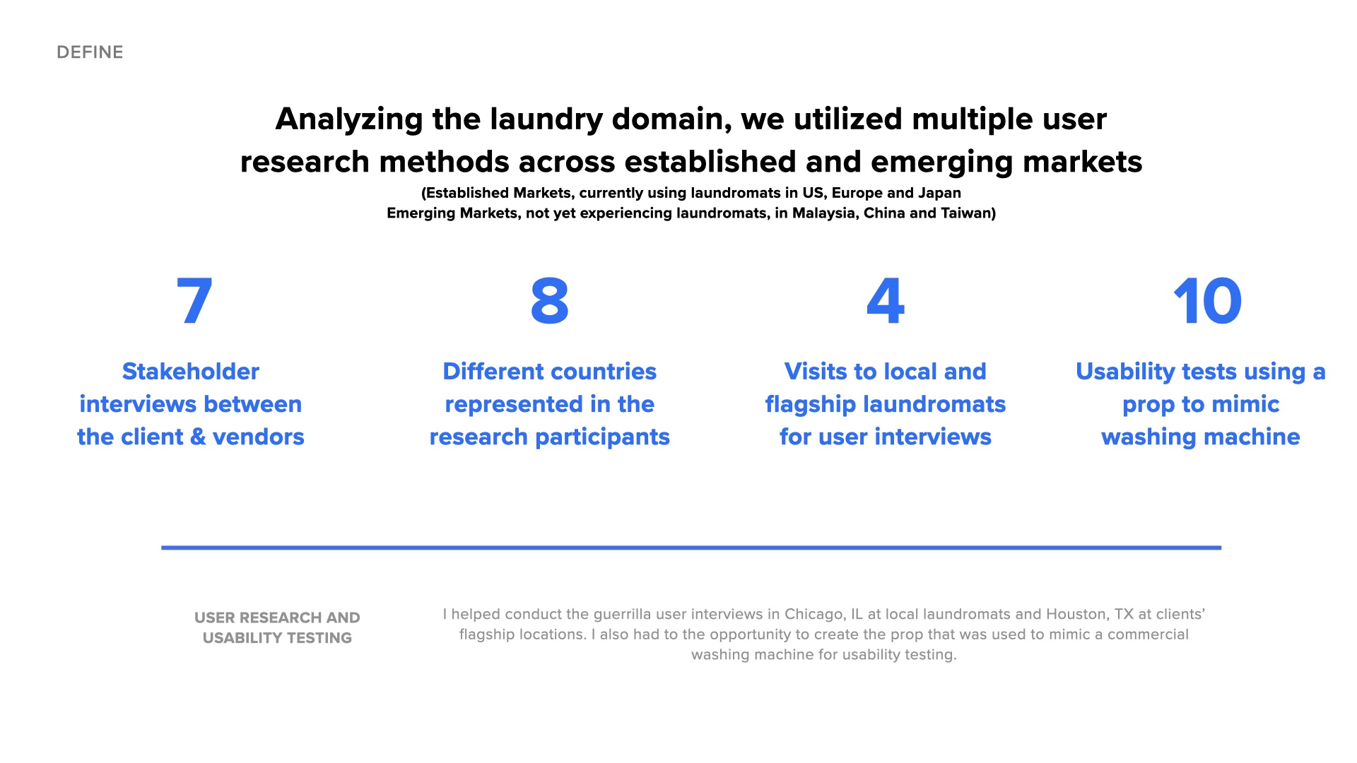
Interviewed 55 participants across established markets (US, Europe, Japan) and emerging markets (Malaysia, China, Taiwan) using text, voice and video responses. Conducted guerrilla user interviews at local laundromats in Chicago and Houston.
Conducted 3 rounds of usability testing with 2 Axure prototypes. Built a custom commercial washing machine prop with android tablet and two-way mirror. Narrowed 2 concepts down to 1 for final round.
Created documentation alongside a fully functional Axure prototype with math functions for developer handoff. Final usability round was conducted virtually and internationally.
We uncovered insights from conducting stakeholder interviews, mobile ethnography, and user interviews across 6 different countries.
Cycle/load selection differed between continents: Europeans sorted by temp and separated lights & darks. US users sorted by cold, warm, hot, separated & used different soap per load. Japan, China & Taiwan used regular (not hot) settings but added on features.
Majority learned to do laundry from mother or grandmother. As time passed, trial and error was conducted when living on their own. Load types by market varied: Colors, whites, sheets, towels, delicates, sporty, silks, and sometimes even everything together.
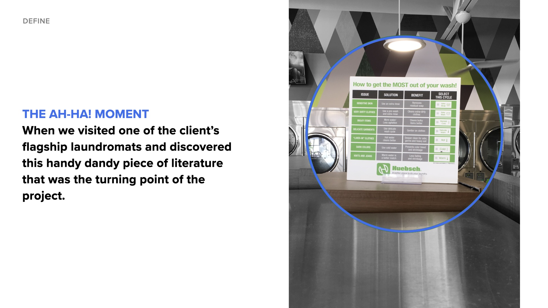
When we visited one of the client's flagship laundromats, we discovered a handy piece of literature titled "How to get the Most out of your wash!" - this became the turning point of the project.
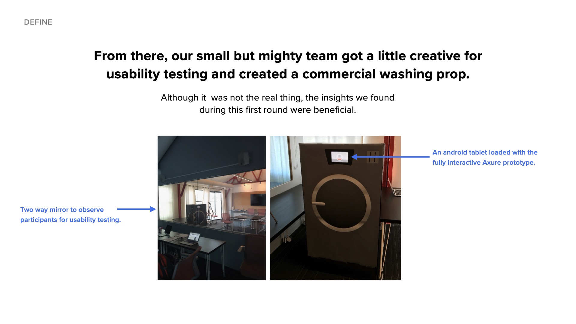
Our small but mighty team got creative for usability testing and created a commercial washing prop with an Android tablet loaded with the fully interactive Axure prototype and a two-way mirror to observe participants.
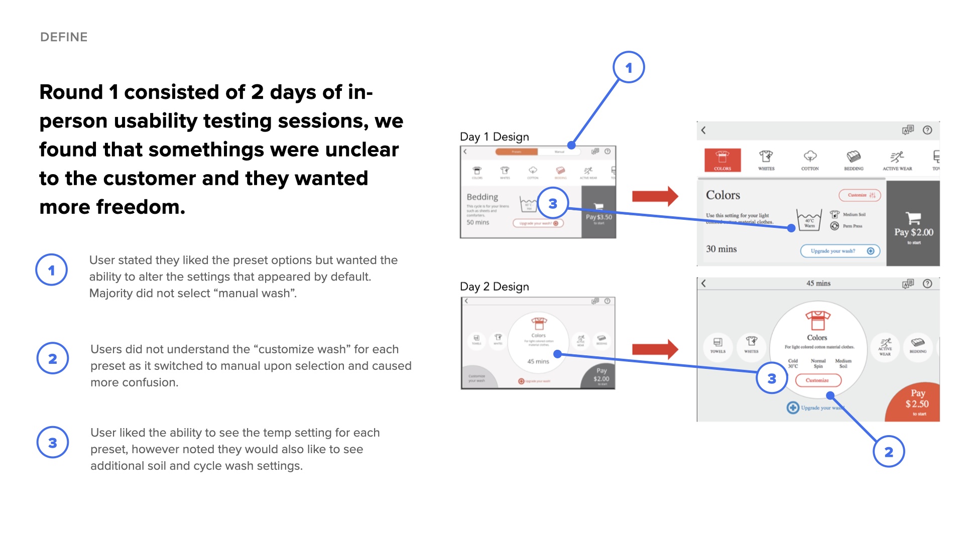
Users liked the preset options but wanted the ability to alter the settings that appeared by default. The "customize wash" option confused users as it switched to manual mode.
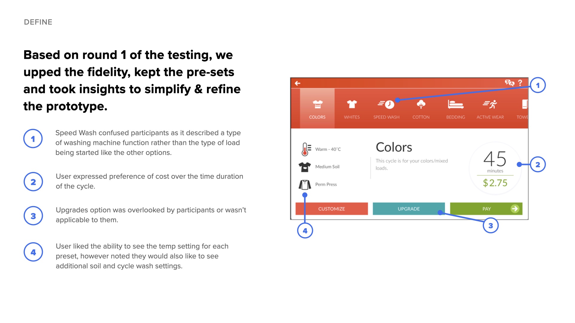
"Speed Wash" confused participants as it described a machine function rather than load type. Users expressed preference for cost over time duration. Upgrade options were often overlooked.
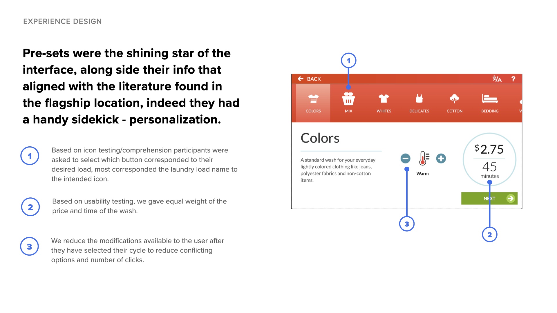
Participants were asked to select which button corresponded to their desired load. Most correctly corresponded the laundry load name to the intended icon.
Pre-sets became the shining star of the interface, aligned with the literature found in the flagship location. Their handy sidekick was personalization.
Each preset displayed enriching information matching the helpful literature users referenced at laundromats.
Based on usability testing, we gave equal weight to the price and time of the wash, addressing user preferences for upfront cost visibility.
We reduced the modifications available after cycle selection to minimize conflicting options and number of clicks.
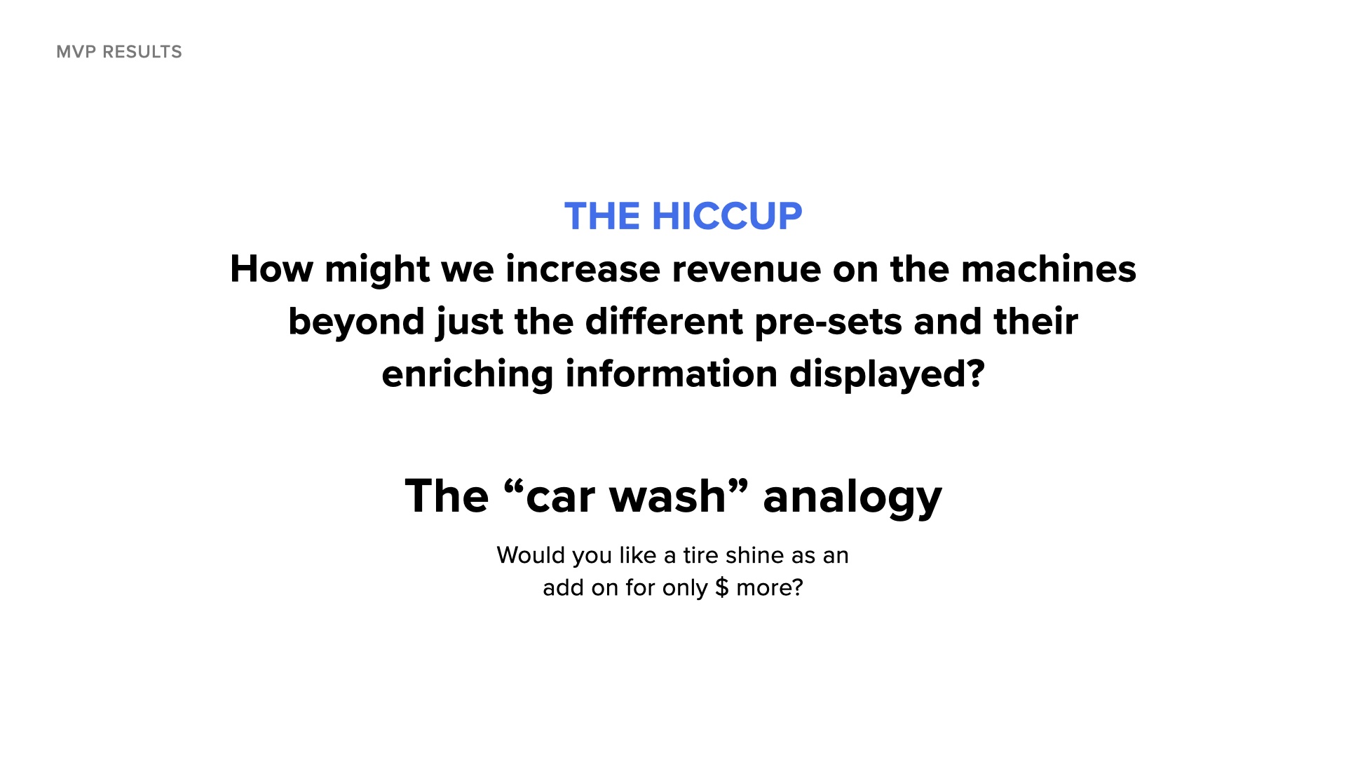
The Hiccup: How might we increase revenue on the machines beyond just the different pre-sets and their enriching information?
The "car wash" analogy: "Would you like a tire shine as an add-on for only $ more?"
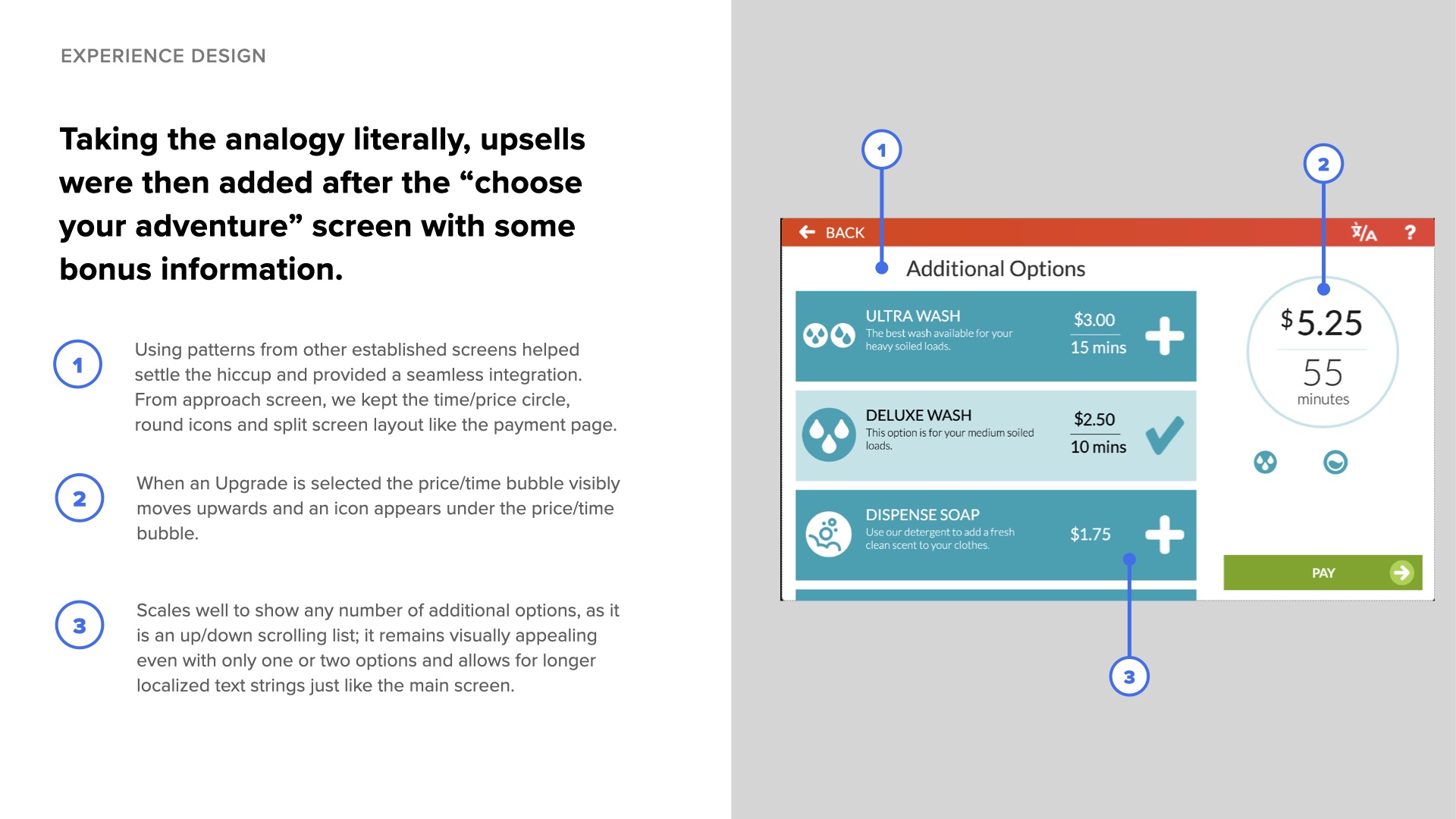
Taking the analogy literally, upsells were added after the "choose your adventure" screen. Using patterns from other established screens helped settle the hiccup and provided seamless integration: we kept the time/price circle, round icons, and split screen layout like the payment page. The design scales well to show any number of additional options as a scrolling list.
Listen to the client, balance with user needs: Always listen to the client on how to make money but keep that balance of not muddying the waters for the customer.
Small things matter: Sometimes it's the smallest things that make or break ideations - such as the poster that was a piece of literature in the flagship locations.
Patience is a virtue: End-to-end projects are long. While I did not stay until the end, the project was launched 2 years later after handoff.
Question the brief: There was no problem to solve for the client - they just wanted to innovate for the sake of being innovated. We could have done more research to see if that literature was helpful in retrospect before designing a touchscreen interface.