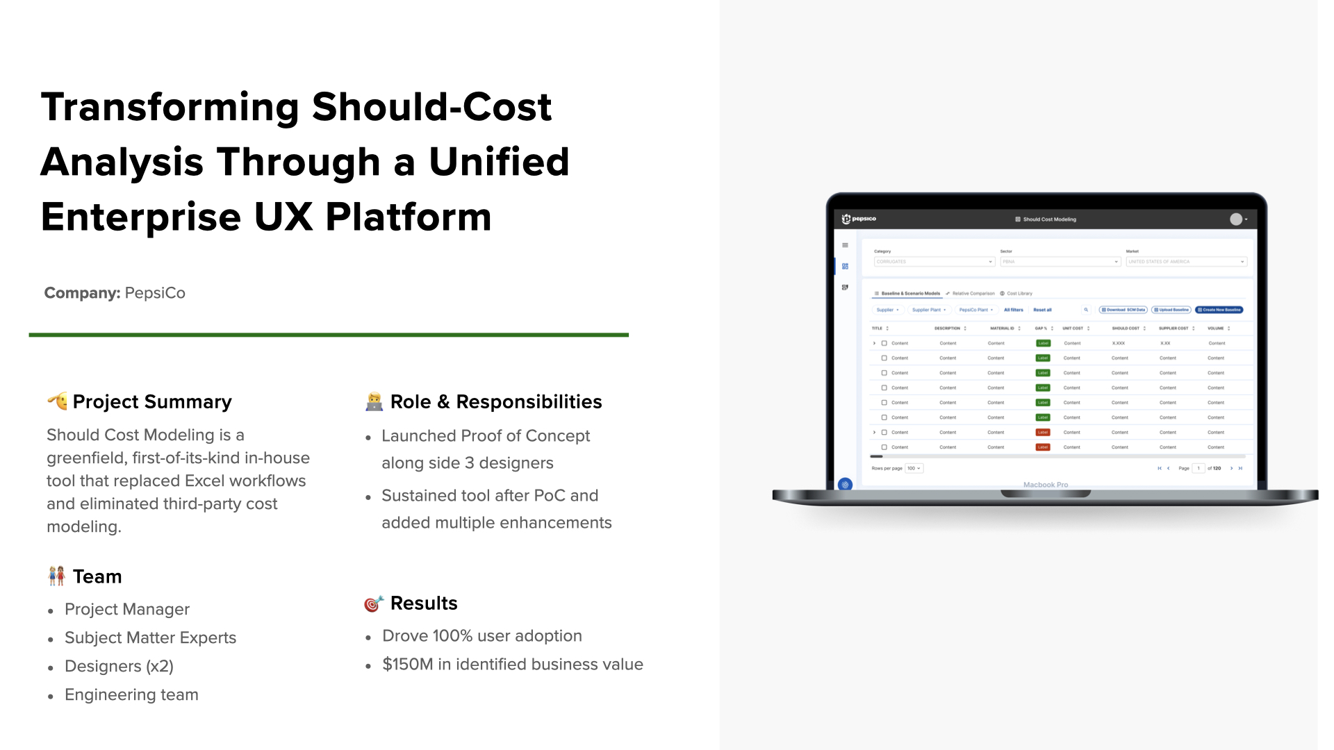
Transforming Should-Cost Analysis Through a Unified Enterprise Platform
Building PepsiCo's first in-house procurement tool from the ground up - learning a complex domain while designing it.
Building PepsiCo's first in-house procurement tool from the ground up - learning a complex domain while designing it.
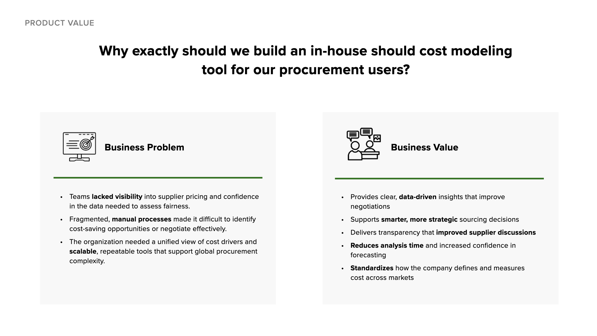
PepsiCo is a global food and beverage leader operating across 200+ countries. Their procurement teams negotiate billions in supplier contracts annually - but until now, they had no standardized way to analyze what products should cost.
Their mission for this project: give procurement teams a single source of truth for should-cost modeling that eliminates manual Excel workflows and third-party dependencies.
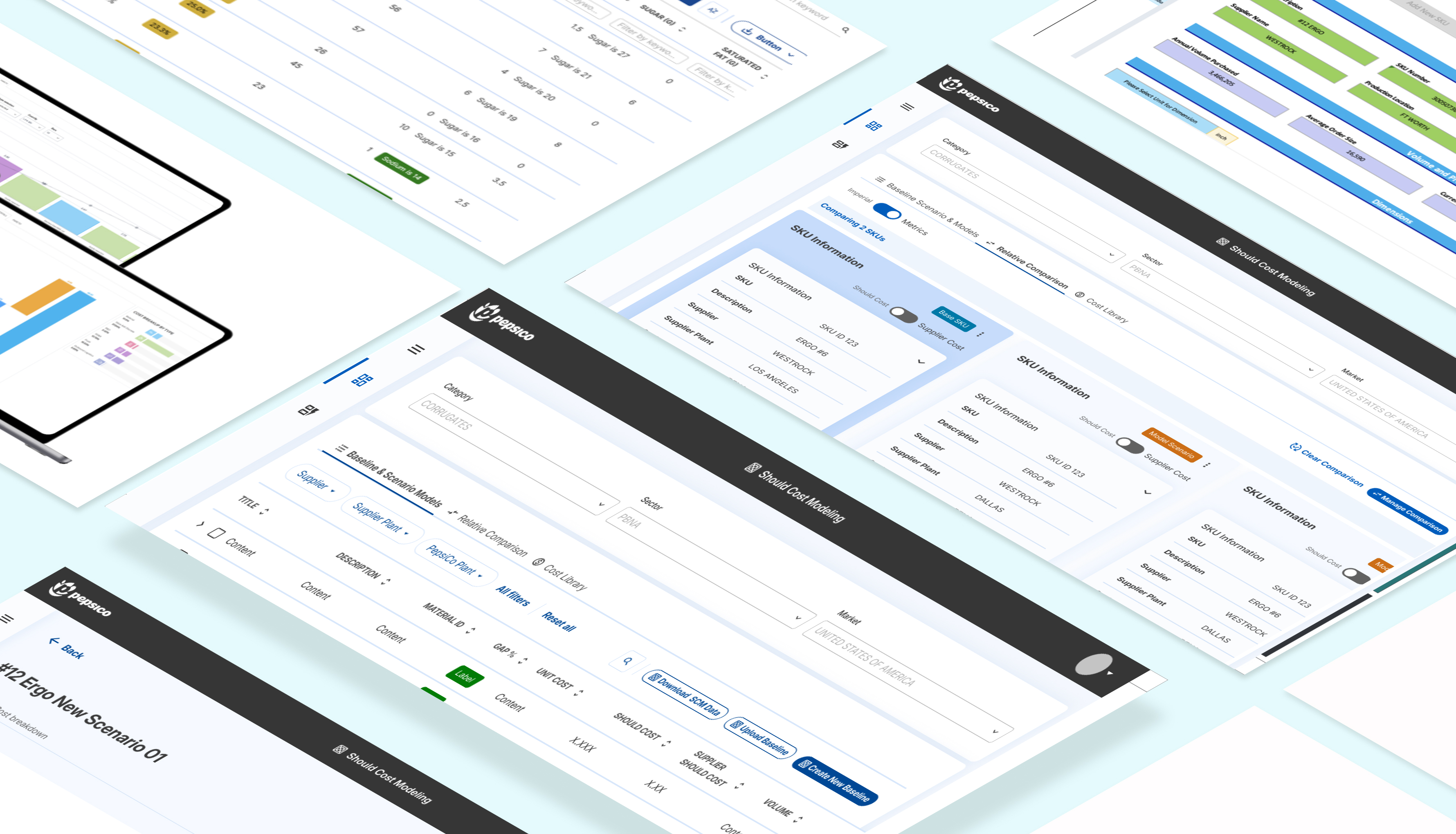
Before this tool existed, PepsiCo's procurement teams analyzed SKU costs using fragmented Excel spreadsheets and third-party tools. Teams lacked visibility into supplier pricing and couldn't identify cost-saving opportunities at scale across 41 global markets.
My challenge: I had three months to learn a procurement domain I knew nothing about while contributing to the design and development of the tool. How do you become useful to a team when you barely understand what they do?
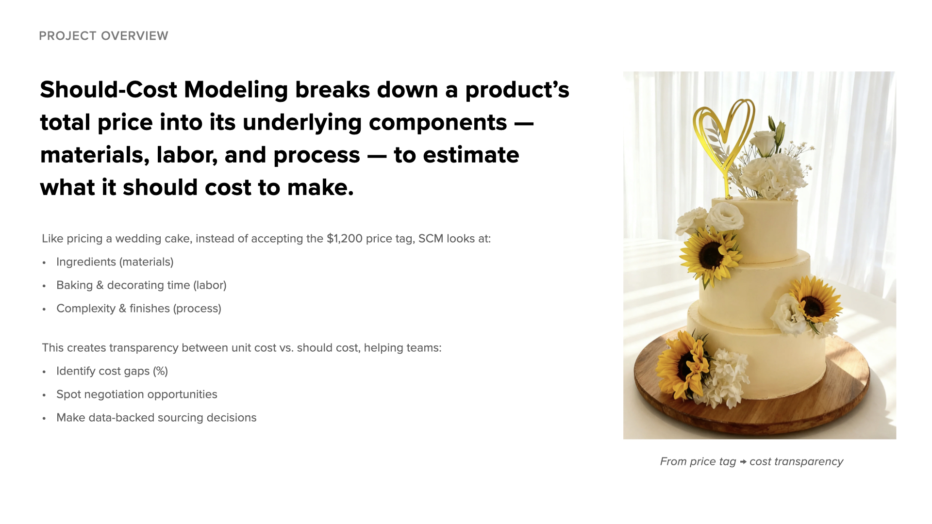
"Should-cost modeling is like figuring out what a wedding cake should cost by breaking down each ingredient and step - so you can negotiate confidently instead of guessing."
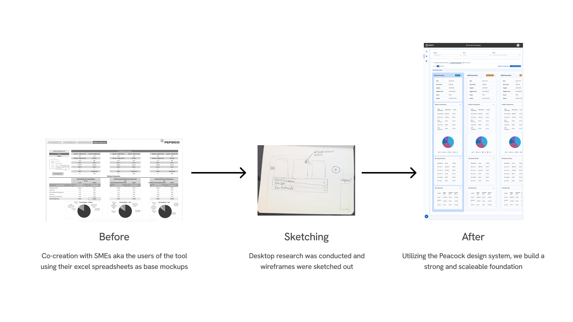
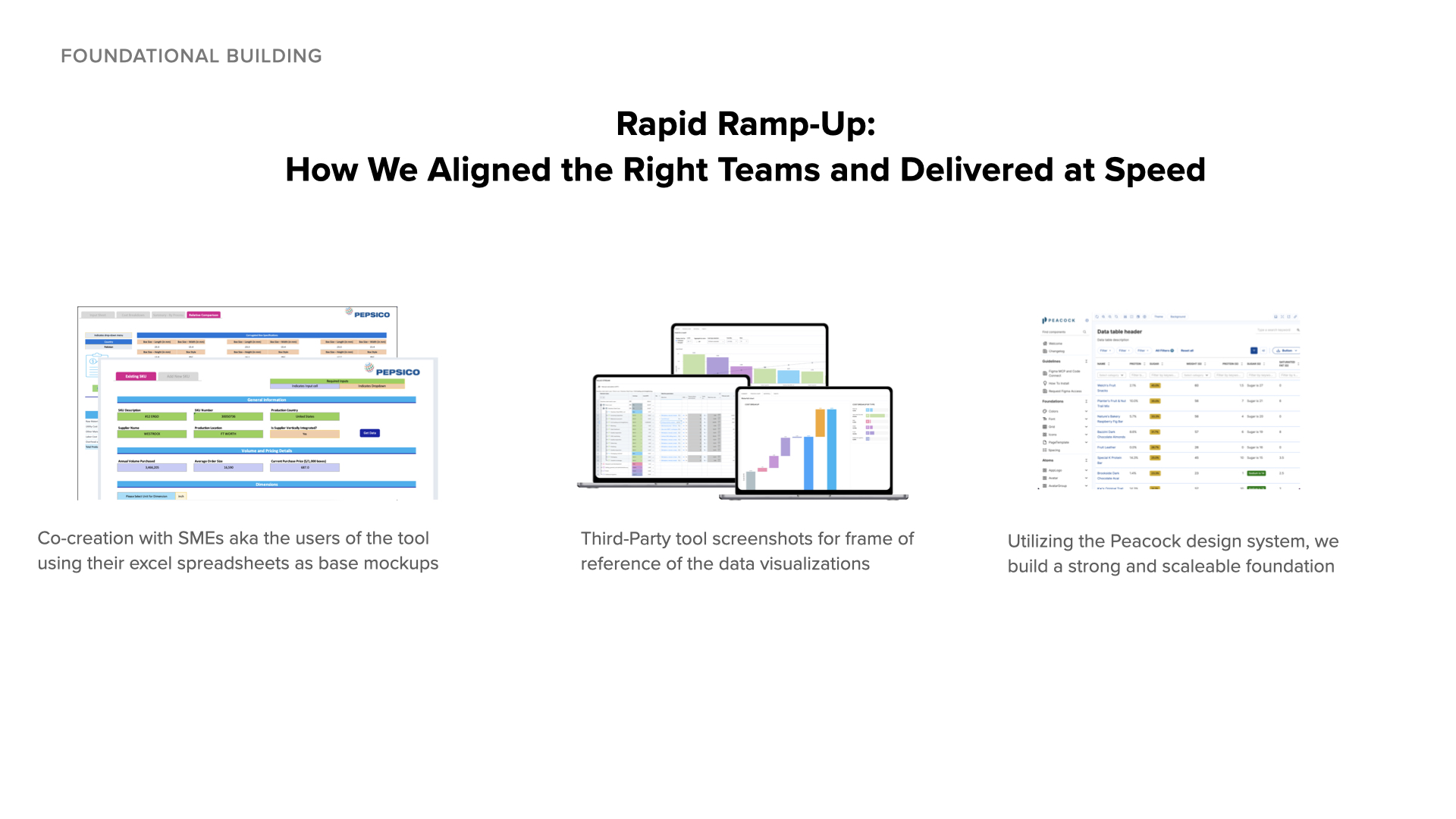
I didn't have procurement expertise when I started, so I treated SMEs as my teachers and their Excel spreadsheets as my textbooks. Rather than waiting to fully understand the domain before contributing, I learned by doing.
SMEs walked me through their existing Excel models - showing me how they used formulas, what overrides they made manually, and why certain calculations mattered. I studied these spreadsheets to understand inputs and outputs, using them as my reference when designing the UI.
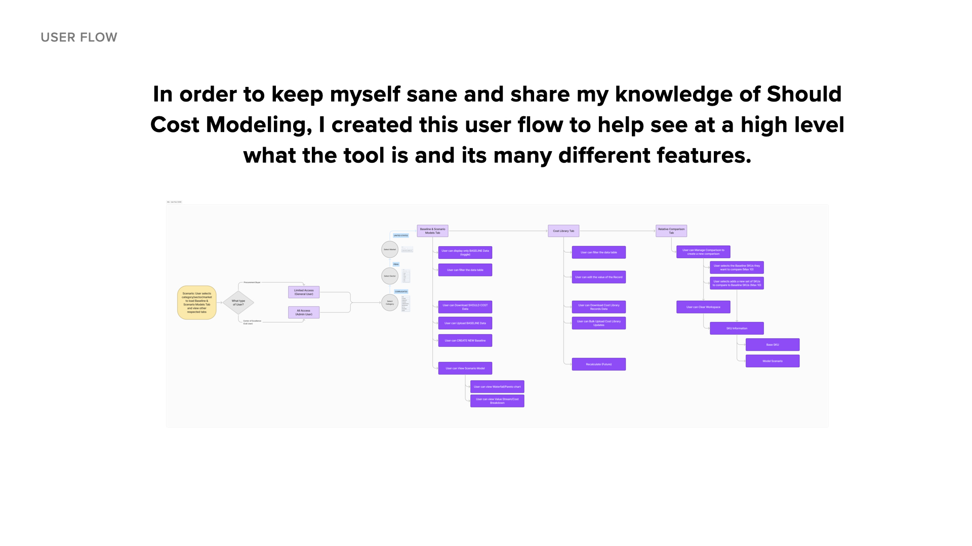
As I learned, I documented the key flows and relationships to help the team stay aligned. These artifacts helped surface gaps in our understanding and supported onboarding as new designers joined the project. In greenfield projects, making the invisible visible is often your biggest contribution.
The turning point: I realized we weren't replacing their Excel sheets - we were standardizing the intelligence within them. Users had built sophisticated models over years. They weren't resistant to change; they were protective of workflows they'd perfected. Once they saw their logic reflected in the UI, adoption followed naturally.
I designed features within PepsiCo's Peacock design system, making decisions about interaction patterns, component usage, and how to translate complex workflows into clear interfaces.
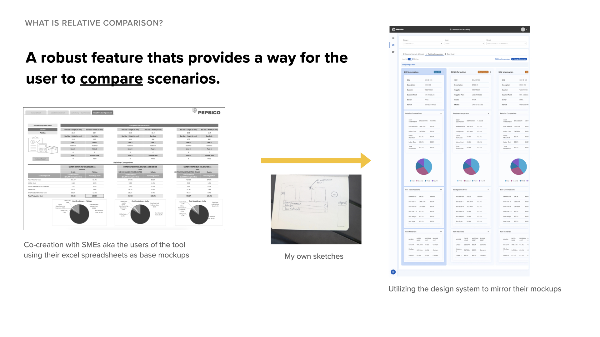
During the PoC, users could create cost scenarios but had to manually track differences between them. SMEs built their own Excel version to demonstrate how a comparison feature should work.
A comparison tool that allows users to view baseline SKUs alongside alternative scenarios to identify cost-saving opportunities. This became one of the most-used features post-launch.
I implemented features using the Peacock design system, making decisions about component selection, interaction patterns, and user guidance.
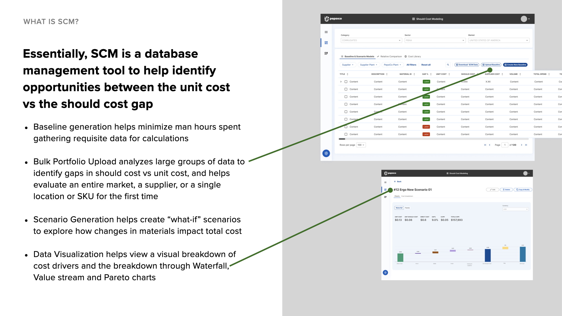
What it does: Generates baseline cost data for should-cost analysis
My decisions: Selected design system components for the data table loading states and error messaging. Since generation could take several minutes, I added progress indicators and explanatory text to set expectations during processing.
What it does: Processes large SKU portfolios for analysis
My decisions: Implemented the upload flow using design system patterns. Working with SMEs to understand common errors, I wrote clear error messages that helped users fix issues like missing columns or formatting problems without contacting support.
What it does: Creates alternative cost scenarios
My decisions: Implemented guardrails to prevent accidental data overwrites. Added confirmation dialogs for destructive actions and visual indicators to distinguish scenarios from baseline data.
What it does: Displays cost drivers through charts and graphs
My decisions: Integrated charts and graphs from the third-party platform SMEs were already using. I made decisions about how to embed these visualizations into the product experience and how they fit into the analysis workflow while maintaining design system consistency.
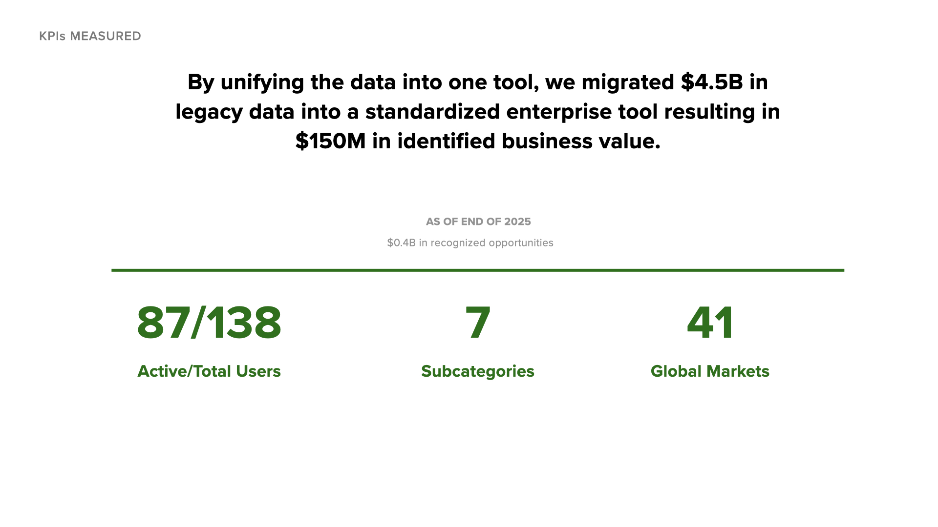
For the first time in PepsiCo's history, all cost modeling data lives in one place. No more version control nightmares across regional Excel files.
The tool supports 7 subcategories and 41 global markets by building flexibility into the data model while keeping the UI consistent.
By treating SMEs as co-designers, we ensured the tool matched their mental models and actual workflows - leading to natural adoption.
My superpower is making sense of chaos: I don't need to be the domain expert - I need to be the translator. By admitting what I didn't know and showing genuine curiosity, SMEs became invested in teaching me.
Documentation is design work: The user flow I created became as valuable as the screens themselves. In greenfield projects, making the invisible visible is often your biggest contribution.
Know when to push the design system: Staying within Peacock's guardrails gave us speed and consistency. But advocating for thoughtful extensions improved the system for everyone.
Design for adoption, not just function: We achieved 100% adoption among active users not because we built every feature, but because we built the RIGHT features with the people who'd use them. In enterprise UX, your users are your co-designers.